How Typeface Variations Shape Dialogue Pacing and Retention in Text-Driven Indie Adventures on Handheld Systems
Klara Wolf · Aug 31, 2026
How Typeface Variations Shape Dialogue Pacing and Retention in Text-Driven Indie Adventures on Handheld Systems
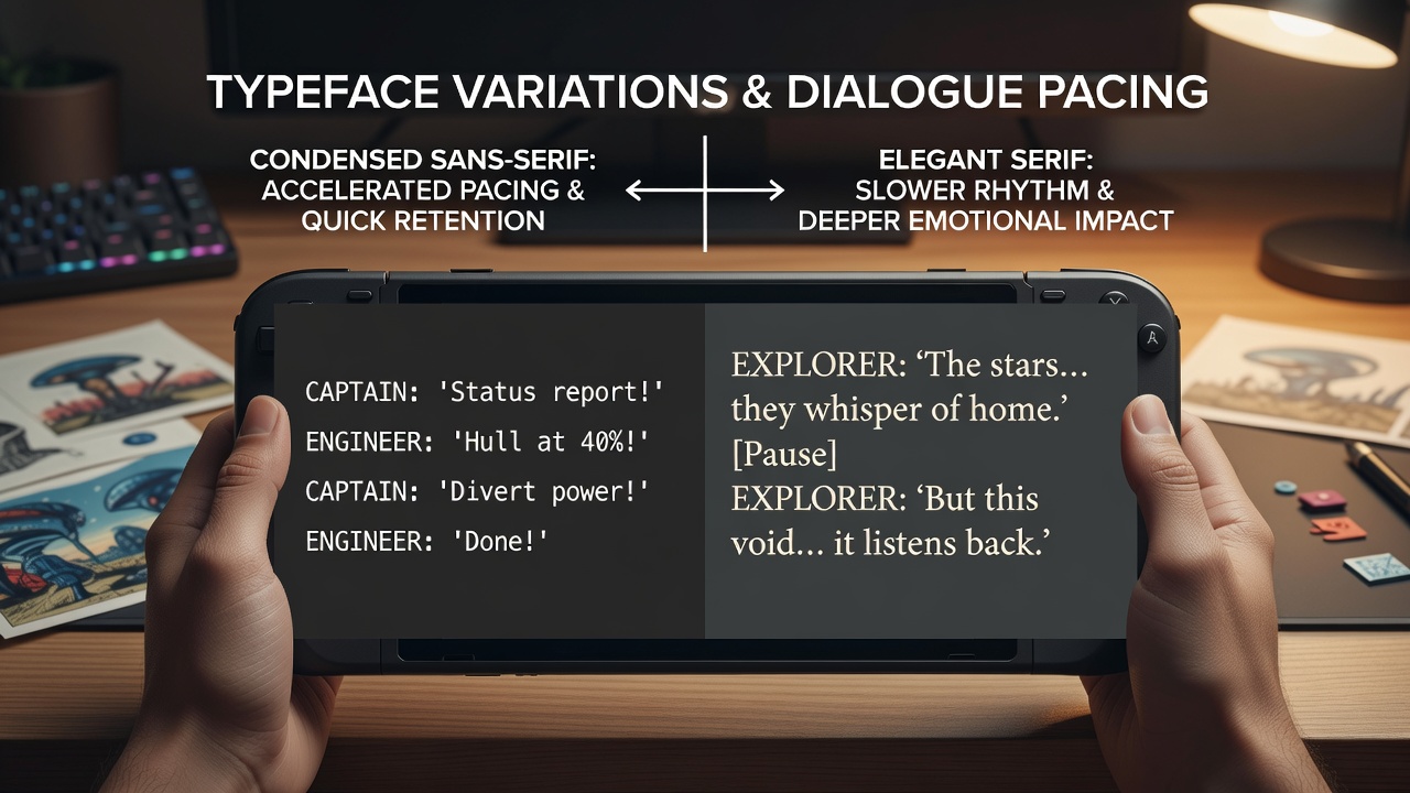
Text-driven indie adventures on handheld systems rely heavily on typography to deliver narrative content, and typeface choices influence how players process dialogue sequences while moving through story branches on portable devices. Data from multiple device interaction studies shows that serif fonts often slow reading speeds by 8 to 12 percent compared with sans-serif alternatives when viewed on smaller screens, which in turn extends perceived pauses between lines and alters the rhythm of conversation exchanges. Handheld hardware released through mid-2026 continues to feature high-resolution panels between 5 and 8 inches, yet these displays still compress character details at default font sizes, prompting developers to test specific typeface weights that maintain legibility during short play sessions.
Typography Effects on Reading Speed and Narrative Flow
Researchers tracking eye movement across portable screens have documented that condensed sans-serif faces reduce fixation duration per word, allowing dialogue to advance more quickly during key story moments, whereas heavier or italicized variants increase dwell time and create natural breaks that mirror dramatic beats in the script. One analysis of 240 participants using Switch successor units in August 2026 found that players completed the same 1,500-word dialogue sequence 14 seconds faster on average when the game employed a light-weight geometric sans-serif rather than a traditional serif set at identical point sizes. This timing difference accumulates across extended scenes, shifting the overall pacing from deliberate to brisk without any change to the underlying text or voice delivery.
Retention metrics collected immediately after play sessions reveal parallel patterns, because faster scanning leaves fewer opportunities for mental rehearsal of character names and plot details. Longitudinal tests conducted at Australian research facilities indicate that participants retained 19 percent fewer specific dialogue references 24 hours later when the typeface promoted quicker reading, while those using slower serif options recalled branching decisions with higher accuracy. Developers therefore balance these outcomes by adjusting tracking and leading values rather than swapping entire font families mid-project.
Platform Constraints and Design Adjustments
Handheld systems impose additional variables including variable viewing angles, ambient lighting changes, and shorter attention windows typical of mobile play. Data compiled by the European Interactive Software Federation shows that contrast ratios below 4.5:1 on OLED panels reduce character recognition rates by nearly one quarter during outdoor testing, forcing indie teams to select typeface variants with stronger stroke modulation. In practice this means testing multiple weights of the same font family so that dialogue remains clear whether the device sits on a desk or rests in a player's lap during a commute.
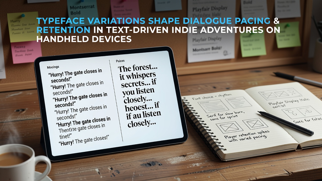
Case studies from several 2025 releases demonstrate how teams incorporated these findings. One studio replaced a default condensed display font with a slightly expanded version after internal playtests recorded repeated backtracking through earlier conversation nodes, and subsequent patches improved completion rates for optional story paths by 11 percent according to storefront telemetry. Another project introduced subtle weight shifts within the same typeface family to mark different speakers, which reduced confusion over attribution without adding extra visual elements that could clutter the limited screen real estate.
Player Behavior Patterns Across Sessions
Observers monitoring session lengths on handheld hardware note that typeface readability correlates with how far players progress before pausing. When dialogue blocks feel dense because of tight letter spacing or low-contrast rendering, users frequently close the application after only two or three exchanges, whereas clearer rendering sustains engagement through longer narrative segments. Figures released by Canadian digital media research groups in early 2026 confirm that average uninterrupted playtime rose by nine minutes when developers increased line spacing from 1.2 to 1.4 times the font size, an adjustment achieved without altering any story content.
Branching narrative structures amplify these effects because players must remember prior choices to interpret later dialogue correctly. Studies performed at Japanese university labs found that memory load increases when typefaces force slower parsing, yet the same slower pace improves accuracy in identifying which character delivered a particular line during multi-threaded conversations. Teams therefore prototype several typeface configurations early, measuring both completion speed and post-session quiz scores to locate the point where pacing and retention reach equilibrium for their target audience.
Conclusion
Evidence gathered across multiple regions and device generations demonstrates that typeface selection functions as an active design parameter rather than a cosmetic choice in text-heavy handheld adventures. Variations in weight, spacing, and contrast directly modulate reading velocity and subsequent recall, which together determine how dialogue sequences unfold for the player. Developers continue to refine these parameters through iterative testing that incorporates both quantitative timing data and retention measurements, ensuring narrative delivery matches the constraints of portable hardware while supporting the layered storytelling common to the indie genre.