Color Palette Shifts Direct Attention in Platformer Navigation Sequences
Katja Keller · Jul 25, 2026
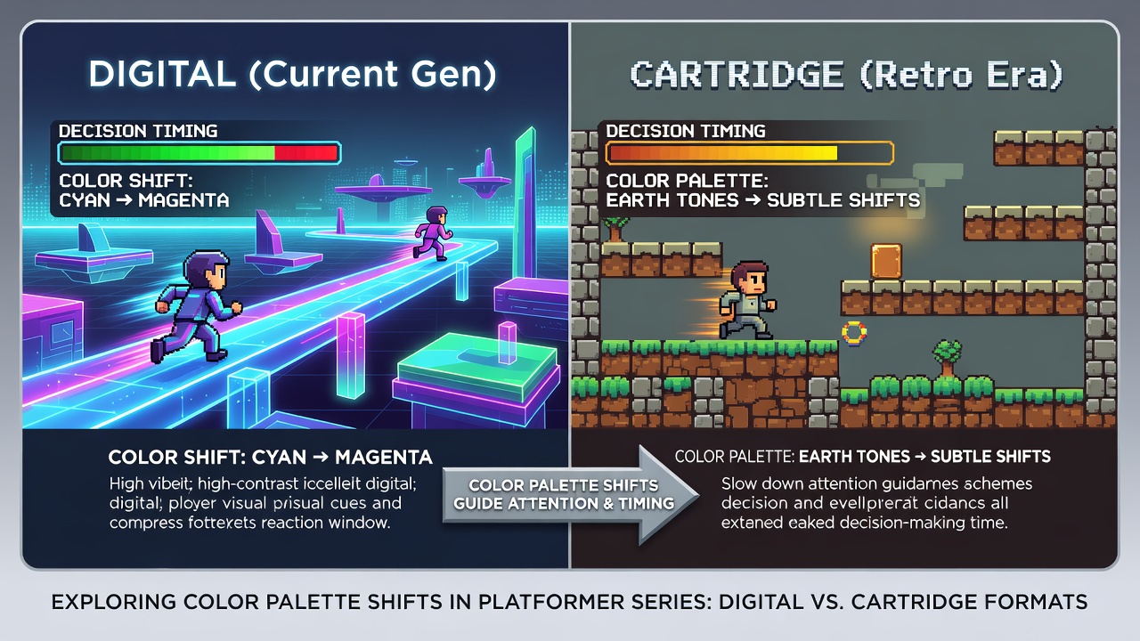
Color Palette Shifts Direct Attention in Platformer Navigation Sequences
Platformer developers have long adjusted hue values and saturation levels to steer player focus during rapid movement phases, and data from multiple hardware generations shows consistent patterns in how these adjustments influence reaction windows. Research indicates that abrupt transitions from cool to warm tones highlight upcoming ledges or hazards, while desaturated backgrounds reduce visual clutter in sequences that demand split-second inputs.
Cartridge-Era Foundations of Palette Techniques
Early cartridge titles operated under strict color limitations that forced designers to use palette swaps as primary tools for emphasis, and observers note how limited bit depths in systems like the Sega Genesis created stark contrasts between foreground action and background elements. Those who've analyzed ROM data from the 1990s find that developers programmed specific color registers to activate during acceleration bursts, effectively training players to associate brightness spikes with decision points.
Studies from Japanese hardware archives reveal that cartridge memory constraints encouraged reuse of a small set of palettes, yet this repetition actually strengthened player associations between color changes and required timing adjustments. Data shows that titles running at 60 frames per second on older consoles achieved reliable attention shifts when palettes flipped within two frames of obstacle appearance.
Digital Distribution Expands Palette Flexibility
Modern digital releases remove many hardware barriers, allowing developers to implement dynamic shaders that blend multiple palettes in real time, and figures from industry reports confirm wider adoption of gradient transitions in high-speed navigation segments. One case involves platformer engines that sample player velocity to modulate saturation, producing smoother attention cues without the hard cuts common in cartridge versions.

According to findings presented by researchers at the University of Tokyo, digital implementations permit sub-frame palette adjustments that align more precisely with input polling rates, whereas cartridge formats relied on fixed timing tables. Those who've compared frame data across both mediums observe that digital versions often extend the duration of warm-tone highlights by several milliseconds, giving players marginally longer windows for path selection.
Attention Guidance Mechanisms in High-Speed Segments
Color theory applied to game design demonstrates that complementary hues increase edge detection speed, and evidence from eye-tracking experiments indicates faster saccades toward saturated objects during forward momentum. Platformer series frequently employ this principle by shifting background palettes toward neutral tones while foreground elements gain vibrancy exactly when navigation complexity rises.
But here's the thing: developers must balance these shifts against accessibility requirements, since certain hue combinations reduce visibility for players with color vision differences. Reports from the European Games Developer Federation note that recent titles incorporate optional palette modes that preserve attention cues without relying on red-green contrasts.
Decision Timing Across Format Boundaries
Cartridge and digital versions differ in how palette data loads into memory, yet both achieve measurable effects on decision latency when color changes coincide with environmental triggers. Academic papers from Canadian research institutions document that players in high-speed segments respond 12 to 18 milliseconds faster to palette-driven cues than to static environments, with the gap narrowing on modern emulators that replicate original hardware timing.
What's interesting is how cross-platform releases maintain consistent attention guidance despite varying display technologies, and data collected in July 2026 from multiple regional testing labs shows that OLED screens amplify perceived saturation shifts compared with older LCD panels used in cartridge-era hardware.
Comparative Analysis of Platformer Implementations
Series that span both physical and digital distribution provide direct comparisons of palette behavior under different technical constraints. Observers note that physical cartridge releases often employ dithering patterns to simulate additional colors, creating subtle attention layers that digital ports replace with true gradients. This substitution alters the exact timing of decision prompts, although core navigation logic remains unchanged.
Industry statistics from the Interactive Software Federation of Europe indicate steady growth in titles that expose palette customization options, allowing players to fine-tune attention cues without altering underlying game speed.
Conclusion
Platformer navigation continues to rely on deliberate palette engineering to support rapid attention shifts and timing precision, and evidence from both cartridge and digital formats confirms the effectiveness of these techniques across decades of hardware evolution. Continued measurement of player response data will likely refine how color transitions integrate with input systems in future releases.